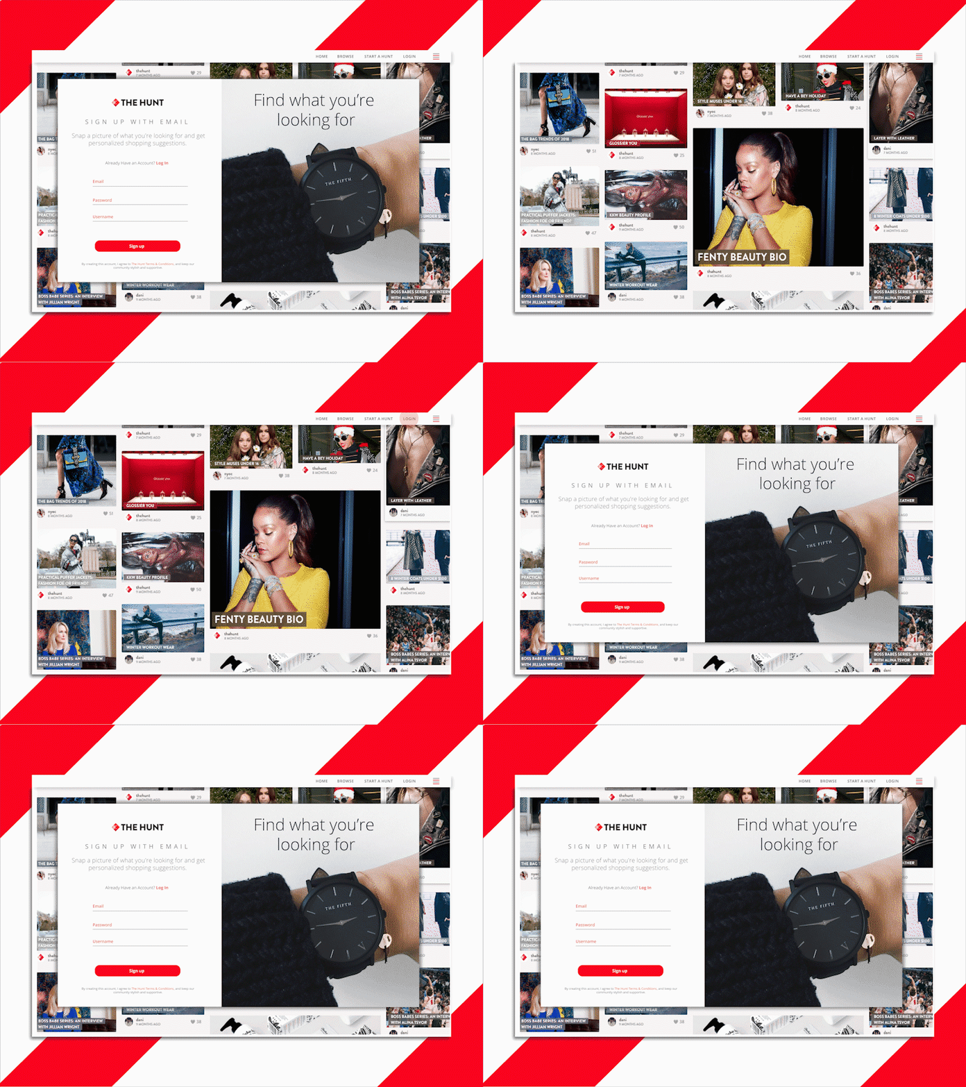
Signup redesign
I've taken the UI challenge and thought to make it a little more interesting. Instead of designing a random ui element I thought I would pick a site I already use that could benefit from a redesign of that particular element and try to make it better.
The hunt is a site that lets you contribute and help other people find a specific product that they've seen online. At the moment their sign up is a little plain so I gave it a more exciting look.
Let me know what you think!
#dailyui #001
No copyright infringement intended. If you believe this post doesn't qualify under fair use please email or message me and I'll be happy to make the appropriate adjustments.
More by Adina View profile
Like
