Telegram Website Redesign
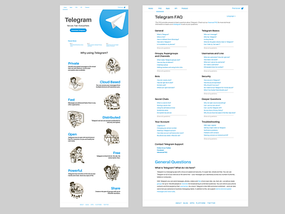
This is a simple redesign of Telegram's website that I crafted in order to exemplify what, in my opinion, Telegram should start aiming to in their product branding in order to attract more users and become more mainstream.
The basic concepts behind this redesign are a different and more modern font, bigger text, brighter colors, and more emphasis on features, maintaining Telegram's original illustrations.
More by Chevy H. Rivas View profile
Like
