Hophead Test Print
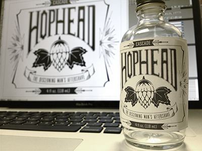
Did a test print of the label and taped it on our bottle, and it doesn't look half bad! Things are readable at the small scale and the ornamentation isn't too distracting from the main title. Wondering if there's a better typeface for that bottom ribbon of text though. Maybe it should just remain lower in the hierarchy?