Booking Awareness
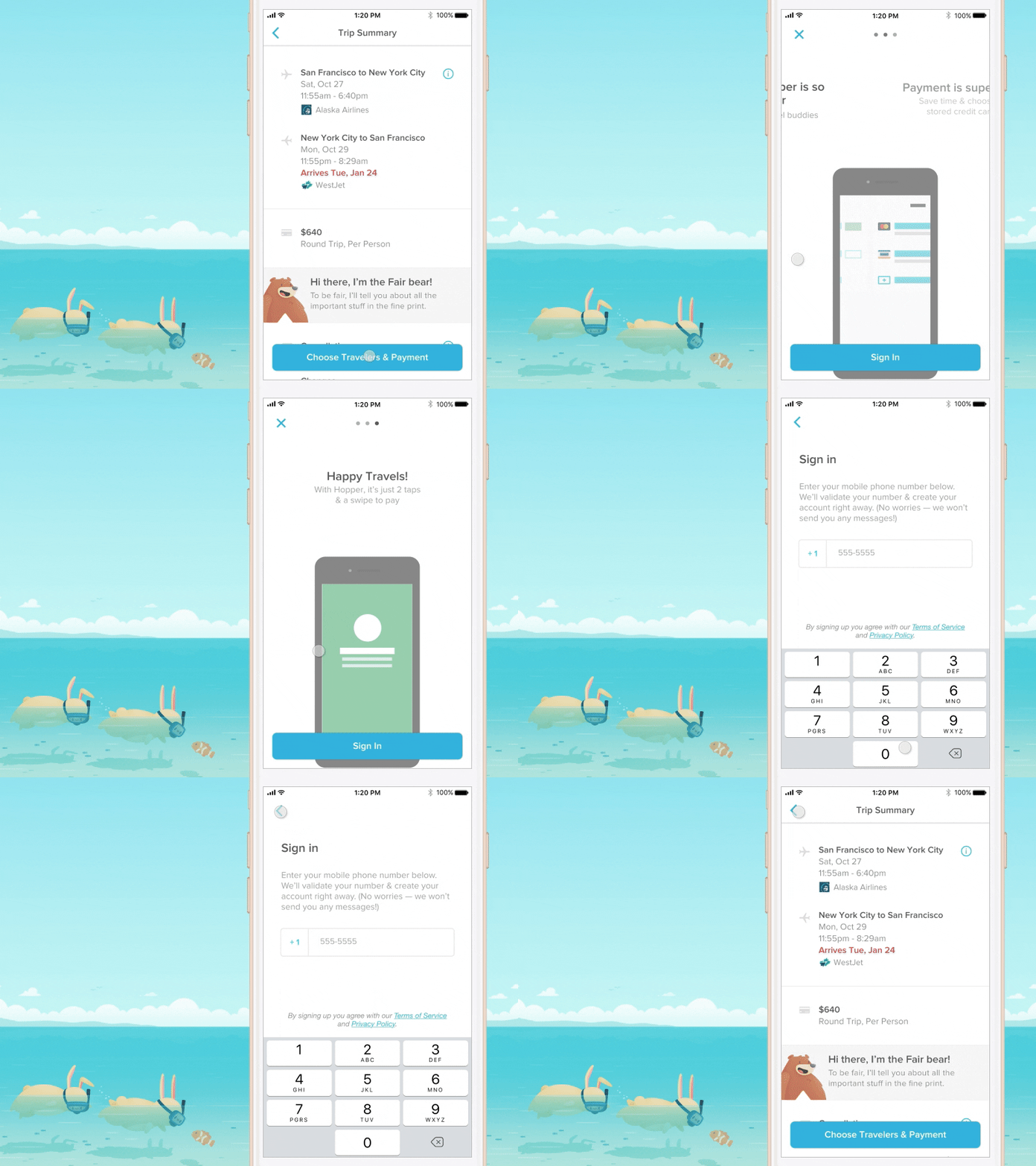
We introduced these 3 screens to our signup prompt to increase new users’ awareness that Hopper isn’t just a place to search for flights — they can book those flights with us too.
The goal was to visually represent how easy it is to book flights on Hopper once the user has created an account: 2 taps and a swipe is all you need!
--
Awesome illos made by @Thomas Fitzpatrick
More by Hopper View profile
Like
