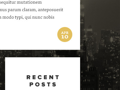
Light - blog post details
Working on a website for 'Light'. Quite happy with how this one is turning out, although it's all quite spaced out, a Dribbble shot doesn't really do it justice. Check out the fullsize version attached. I also used a baseline grid for this design (attached). I've tried it before and ended up abandoning it, but it seems to be working for this design.
More by Jonathan Ogden View profile
Like


