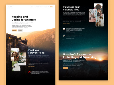
Mariposa SPCA (Dribbble Design Challenge)
A homepage design idea for the Mariposa SPCA, as part of the #dribbbleSPCAchallenge at #Epicurrence Yosemite last week!
Check out the slight iterations on Figma over at https://www.figma.com/file/HyQXz1pjLFbxV4hEkIZbxmcR/Mariposa-SPCA?node-id=0%3A1
//
The primary action color was pulled from the background hero image in order to make the page more approachable and have a softer, warmer feel.
The rounded corners on the buttons were implemented for the same reason, to make it more approachable and human.
Testimonials were included on the site in order to give the social proof that this is an organization worth investing your time and money into to keep it running.
Background images were selected for the organization's love of Yosemite and the national parks whereas the images of the animals were included to highlight the organization's work to save and protect the animals of the area.
