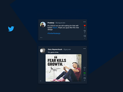
Twitter feed redesign - Dark
Hi folks, I have made the following changes to the existing twitter feed:
• Kinda felt that while scrolling down through twitter feed we accidentally happen to engage with the tweet i.e involuntary like or retweet. So took them to the side to avoid such accidental engagements and easy accessibility through thumb.
• Better placement of time of the tweet. Currently, it is placed alongside the username, tend to cluster for long usernames.
I have placed it on the lower left.
• Better image preview size
• Better menu styling for individual tweets.
I know there is much room for improvisation, would love to know your thoughts.
Press 'L' to show some love. #peace
More by Pradeep ★ View profile
Like
