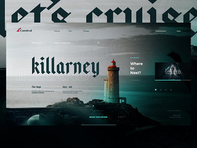
Let's Cruise.
Ex 4 - Carnival Cruise.
My wife and I just got back from an amazing trip in Ireland a couple weeks ago and it is definitely a hard place to shake from your brain. Carnival just so happened to be our next internal @Magnetic Creative design team exercise topic - so obviously I ran with Ireland as the destination focus.
Being a little tight on time, I chose to focus on a specific destination landing page experience that would be flexible stylistically (font choice and color palette) depending on the vibe of the destination. While we were in Ireland the weather was absolutely perfect and we got to experience that overcast - gray skies - light rains vibe so I wanted to capture that feel in my photography choices. Pushing typography lockups and overall type layout on a single landing page experience was a fun challenge to take on. Including as much info and interactivity as possible without coming off visually crowded or confusing was the biggest focus during this exploration. My normal thought process takes the entire space of a scrolling page into consideration, so to work in the parameters of this single full screen landing experience was a fun challenge with this one.
Definitely feel like I could have pushed this one a little bit further and invested more time into it, but in the end happy with how it turned out. Check out the full pixels attached and keep an eye out for more work from the @Magnetic Creative team!
Note: This is spec work only, just to have fun with the design team - Photos courtesy of the unbelievably talented and talented photographers via Unsplash.
-
Searching for your True North? We would love to hear about how we can help. Email us hello@mag.cr

