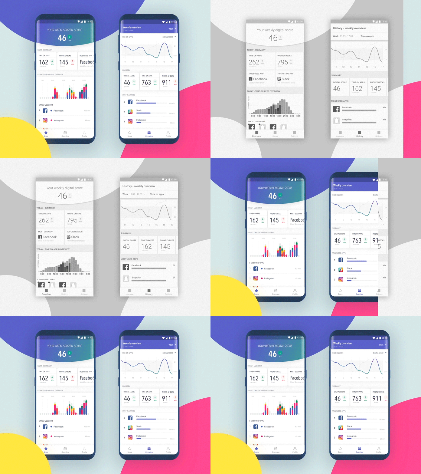
Digital Detox app – wireframes to UI
Hello Dribbblers!
Today I’d like to share an app I worked on about a year ago. The trigger to go back to it and make this shot was Apple’s release of iOS Screen Time, which took place two months ago. I was so shocked by how close my designs (especially wireframes) were to their version! 🙈
It made me feel really proud! 🌟
Here's also a little sneak peak of my process (digital only; personas, testing, IA etc. not included :D)
You can see the very first sketches as well as an animation showing the transition of my design, from the high fidelity wireframes to the final UI.
Hope you like it! 💋
More by App'n'roll View profile
Like


