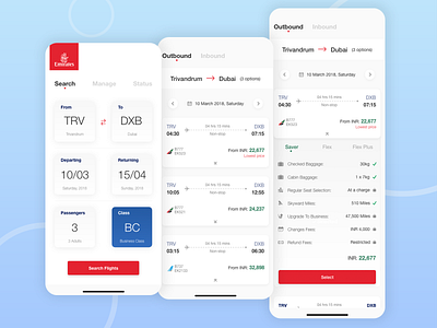
Emirates Flight App Redesign Concept
Felt the need to redesign the Emirates Flight app.
This design tries to embrace the whitespace and present the necessary information to the user with the least amount of cognitive load.
Although this shot only includes 3 screens, it took literal hours to come up with a better way to present the data to the user.
Hope you like it!
More by Allan Abraham View profile
Like
