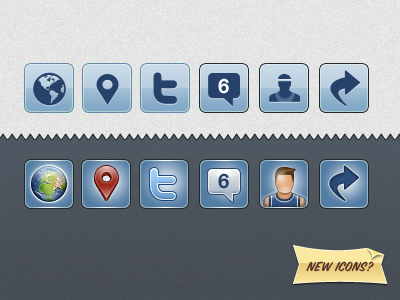
New Dunk Icons?
So as part of the next Dunk update i'm making some UI revisions ahead of the coming portrait mode (yeah, you heard it here first lol).
I've been toying with some new icons and i figured you guys would be the best crowd to ask. What you see here is the old set (above) and my new take (below).
I feel it should be said that the style choice for the original set was founded in the idea that the icons shouldn't call too much attention to themselves which gave them this minimal look. However, i couldn't get this idea of a slightly more detailed set of icons out of my head.
On one hand the minimal look is anonymous and serviceable, they keep out of your way and get the job done. The tradeoff with these new, more detailed, icons is more visual noise in the design but they also add another level of polish and identity to the app.
A classic conundrum, really.
So what do you think? Do you like the new icons better? What is your feelings towards clean vs detailed approaches?
