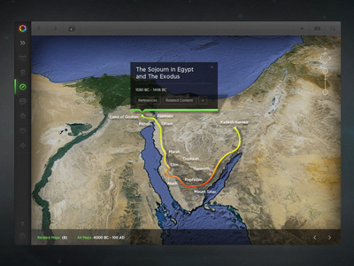
Glo Application Redesign
Updated Glo's interface designs for the iPad and desktop. I chose to continue to use the slide-out navigation features, but I hope this self-initiated redesign would improve the usability of this very complex application. Thoughts?
More by Michael Sevilla View profile
Like


