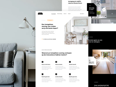
Habitat Sales Page
'Sup guys
Here's the main sales page for the Habitat project. The main sections are the following from top to bottom. On top there's the hero section where the users needs to get exactly what the page is about, what the main benefit is for the client, or a hint to the main benefit and there's a call to action (there should always be a call to action). The second section mentions the benefits there are for the client. Benefits are outcomes a client can have from working with the company (these are mostly emotional benefits like for instance 'Live stressless', 'have more time for your family', etc). The 3rd section is a section where a video will explain the way the company works. Bellow that it's just a listing of the main features the client can get. The most important thing is and almost always will be the (emotional) benefits.
Hope that makes any sense haha.
Let me know what you guys think!
Have a great and productive week! Peace ✌
————————————————————
Get a free lesson about whitespace and balance!
https://mailchi.mp/2a1d8a58aff7/freelesson
————————————————————
Want to learn design and/or animation?
Check out my classes on Skillshare.
Use the links below and get 2 months Skillshare premium for free!
Design class: http://skl.sh/2h4JrWa
Animation class: https://skl.sh/2D8StYQ
Hope you guys enjoy the classes!

