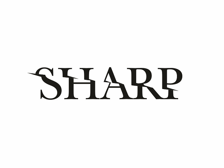
Day 16 of #thirtylogos challenge: Sharp
Sharp has been creating high quality cooking knives for over a decade. They're known for their craftsmanship, quality, and outstanding cuts. They provide a variety of knives from chef to bread, and they needed a new logo to represent their quality. They wanted their logo to be black and white & no colors at all. They like logos that focus on minimalism and feature very subtle details.
This is my day 16 task.
I did a fruit ninja on this logo & i liked how it got shaped up.
Let me know your thoughts in the comments.
Hope you like it :)
More by lohithnk View profile
Like
