gonzographic: Twitter Feed
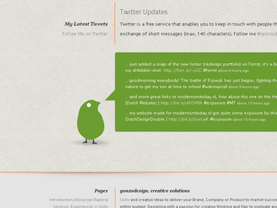
Just added my Twitter-birdie and a textballoon in the redesign of my portfolio. Thinking about making my birdie orange, to fit more in the gray-orange colorscheme?
Didn't add no shadow with CSS3 to the textballoon, the shadow below the birdie is quite cool though? What do you think, please let me know ..?
More by Jan Rajtoral View profile
Like
