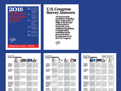
Lowell Votes Primary Guide Pages
This is the 2018 Primary Election Guide, focusing on the MA-3 Congressional race.
Lowell Votes prides itself on representing candidates clearly, concisely, and fairly. So, great care in how these candidates are compared is taken and factors in to many of the design decisions made.
I believe that a candidates' logo and literature is something worth knowing and comparing. In most cases, these are seen on road signs all over the place. We believe it helps complete a visual connection in our readers' minds.
The headshots are largely provided by candidates, then formatted to fit – great care is taken to ensure that no matter the pose there is an optical equality to how they appear on the page.
The overall grid is capped at 5 columns – one for questions, four for candidates. This document has its roots in municipal elections which can have up to 19 candidates in a primary. Four strikes a balance of volume in candidates and readability. In the case of primaries, we also include the future general election challengers for context.
The typeface and treatments are a callback to retro political literature – large serifs with tight leading and tracking.
