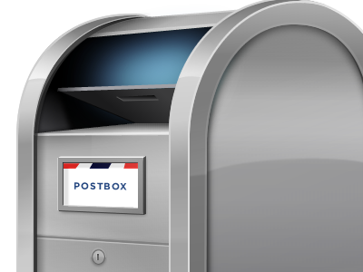
Postbox Icon 2.0 (Shine-O-Matic)
Postbox 2.0 is on the horizon and I've had the opportunity to refresh the icon I designed back in 2008:
http://www.flickr.com/photos/rohdesign/sets/72157613643488885/
I've long wanted to add a little shine to the icon (nicknamed "Stubby") so this is my opportunity to do that and some other tweaks I've been pondering.
The challenge with shine is, how much? If it's too subtle, the shine gets lost at smaller sizes. Too strong and it distracts from the overall icon.
This is my 3 iteration and I'm feeling pretty good about it, but thought my friends on dribbble might help me tune the shine with some helpful feedback.
More by Mike Rohde View profile
Like

