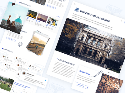
University of Melbourne website
We wanted to refresh and update the framework of their site to align with the thinking of real users. We also focused a lot on web accessibility.
As the result we have a simple and good looking webpage for a better experience.
Like it? Don't forget to follow CadabraStudio.
Let's enjoy it together CadabraStudio.
You can also find us here:
More by Cadabra Studio View profile
Like

