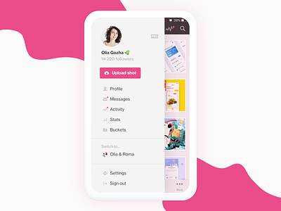
Dribbble iOS app ideas
Hey dear Dribbblers and @Dribbble team,
Here's something I'd like to share with you 😌
It's a well-established fact that we're very passionate about this community and this platform. We care deeply what's going on here, what path Dribbble team will choose to lead us forward and what changes they'll introduce. We certainly appreciate all the efforts they do to make dribblers' life better. So I decided to wrap up all my thought about one particular issue that has been bothering me as a regular user of Dribbble iOS app. As a result, there is a case study medium post with step by step reasoning and explanation along the way.
Here's an introduction part:
Recently, I’ve been pretty active on Dribbble sharing my current work in progress. When I say active it means a brand-new post almost every day. This routine increased my interaction with the platform. Without giving any thought, Dribbble iOS app got on top of my list of the most frequent apps on my phone. This is new for me because till recently I haven’t been interested in this app at all mainly because of its design that did feel immature. However, as it happens in life, a need prevails esthetics and here I’m using it on a daily basis despite my emotions. So what does it mean?
Continue reading on Medium — 'Improving Dribbble app navigation step by step'.
Let me know your thoughts on this.
Do you use Dribbble app? Are you happy about it? What do you think about dropdown menu?
Would you like to have such version of the navigation instead of the dropdown?


