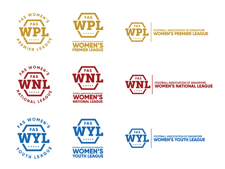
Singapore Women's Football Leagues rebrand
If I was given the chance to rebrand my local women’s football league logo, this is how I will rebrand it.
Currently there is only a logo for the FAS Women’s Premier League and none for the FAS Women’s National League and FAS Women’s Youth League..🤷🏻♀️
The hexagon represents the shape on the ball itself, while I picked slab serif to represent the sporty nature of the sport. The 5 stars are taken from our country’s flag 🇸🇬.
Basically the leagues’ logo follow a standard look, only a change in color. Gold for Premier because it is the top tier league, red for National to signify the fighting spirit in the league, to be the Champion and blue for the Youth to represent the youthfulness in the younger players.
3 different versions/formats are also done for the respective league logos.
Let me know your thoughts, comments and opinions!
