Daily UI #006 - User Profile
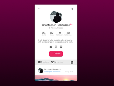
For this challenge, I decided to redesign the profile screen of the dribbble app incorporating the following changes.
The six user profile stats (e.g. no. of followers and shots) were all in the bottom previously, which I thought would be better placed near the top as users can quickly glance through it. However, placing all six of them on the top would cram the screen, so I relocated the projects and buckets stats on the same level as the existing view button, mainly because projects and buckets featured a unique collection that visitors could explore.
I also noticed that some users would post their email address in the description part. Plus, there was no email icon along with the social links. So, I thought of adding it to streamline the emailing process, i.e. a simple tap on that icon rather than copying it, opening email app, then pasting it.
Other changes include a 'pro' icon next to the user's name; a location icon prior to location copy for clarity and aesthetics; left aligned the text in the description box for a better reading experience.
This was probably the most fun challenge so far simply coz there was so much to think about! Hope you like it! :)
P.s. I use android so my suggested changes are based on it, not sure if iOS or other platforms are any different.
