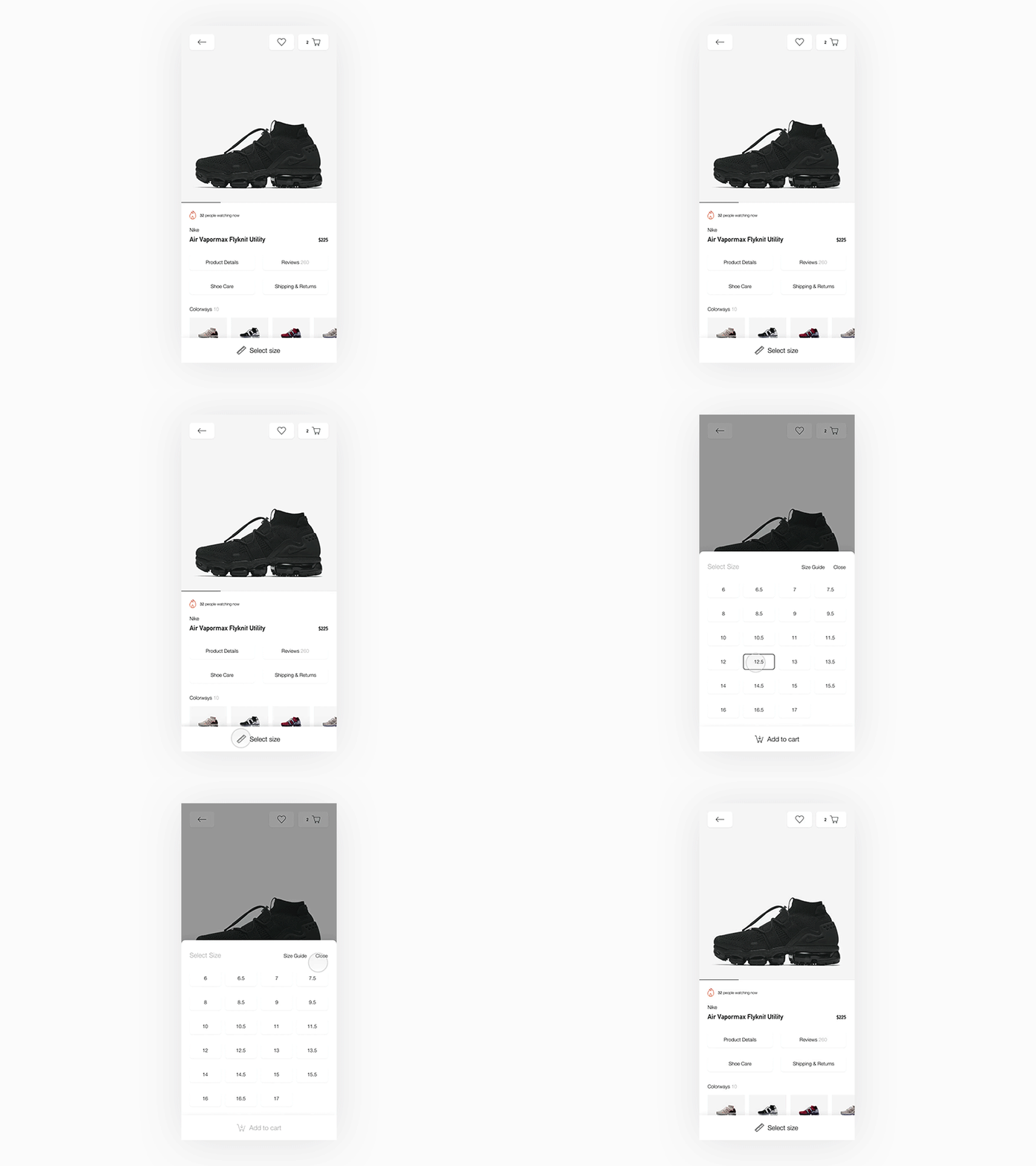
Product Page Exploration - Mobile
Hey everyone!
I wanted to share this mobile product page exploration that I've been working on. The idea was to try and combine the size select with add to cart, rather than having two separate steps (e.i. two CTAs for each alternative stacked or next to each other - which probably is the "traditional" way for responsive web).
Maybe the Add to cart would need to be more prominent, like a color or something.
Feel free to share thoughts!
----
👋🏻Got a freelance project, remote or semi-remote team? 📩Let's talk: jakesunshinestudio@gmail.com
Best,
Jake
More by Jake Sunshine View profile
Like


