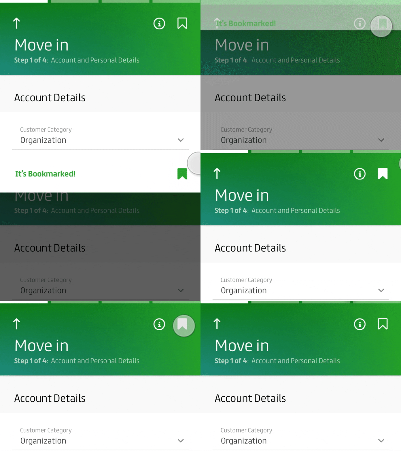
bookmark
The material snack-bars provide brief messages about app processes at the bottom of the screen. In this case, I've placed at the top, as it's closer to the user's signifier. The background uses cognitive and visual contrast between the dark to light green energy and white background for the details and forms fields.
More by Molham Bakir View profile
Like
