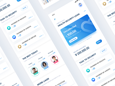
Finance Page Concept Sketch Demo 1
Finance Page Concept Sketch Demo 1 ,
For design to be of greater value, design needs to permeate upstream and downstream, participate in and assist in demand customization, and let design drive commerce.
The intended goal of this page is to enable users to understand and use the health margin business, and the operating area below the main business area assists the main business.
Let users pay attention to the main business area when they see it at the first sight, and avoid the business vision that is too fancy or showy to attract the attention of the main business.
The first draft of this area is to use color blocks as visual highlights, but after careful analysis, it is found that the user's first position is the background color, and then the target text (amount of money) and button will be located after the second focus. So use a clearer color and layout, highlight buttons and target text.
Health Care 页面概念练习,设计从下游渗透到中上游,参与并辅助需求定制,让设计驱动商业。
此页面预期目标为使用户了解并使用Health Care业务,主业务区下方运营区辅助主业务。
让用户第一眼看到时注意力集中到主业务区,避免辅助与运营业务视觉过于花哨或炫技以至于抢占主业务视觉注意力。
MAJOR AVA-E 区域初稿为使用色块作为视觉突出,但经过推敲发现用户第一眼定位到的是底色,经过二次聚焦才会定位到目标文字(钱数)与按钮。所以采用较清亮的用色与布局,突出按钮与目标文字。

