…the thirteen points
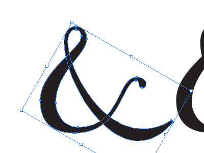
So, some vector extremists/talents would say that the fewer points the better on vector curves, which is true as far as curve smoothness, but sometimes doesn't create the curve/angle/brush-stroke you want. In this dribbble, you can see that I could have used only 9 points for the character, but it wouldn't have been the shape I was working towards. It's a silly topic, really, but also, note that since this typeface uses a right-angled brush stroke, the downward slope of the right leg erroneously has a thickness, instead of a thinness. In this case, it is hinting at a sable-brush type stroke, which gets larger not only on down stroke, like in calligraphy, but more like on your pressure sensitive sketchpad. Still, some of the quirks in typefaces are what give it character. And I'm no pro typeface designer.