Starbucks Navigation
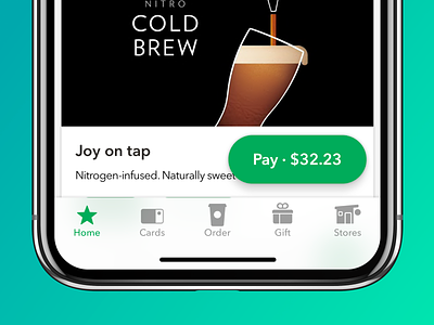
One of the biggest updates we've made to the Starbucks app in the four years I've been here — and a design recommendation over three years in the making. Moving to tab navigation should allow our customers to have a more comfortable experience no matter what device you're on. Plus, customers can get to their barcode with one tap of the Pay FRAP (Floating Resizable Action Pill).
More by Jason Stoff View profile
Like

