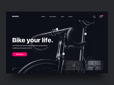
Bikkers landing page - Daily UI Challenge
Daily UI challenge - Landin page for Bikkers, store of bikes
.
.
.
Today I am exploring dark palette colors, using darks blue and for call to action red, the idea of this landing page is sell the bikes showing the features of him, videos and gallery image, the idea is that you can put your specifications about size, weight, times on the week that you will use the bike,etc and a bike will be do for you, you will have a unique bike only for you
Photo by osh Nuttall on unsplash
What do you think?
Available for design work: christvizcarra@gmail.com
Follow on Behance , Instagram
Press L to show some love
Thanks!
More by Unrise View profile
Like

