Shopping cart V2
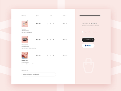
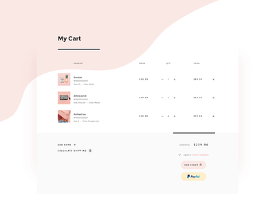
Continuing my e-commerce quest here with you. This time it's alternative layout for the shopping cart I've already posted earlier. This one is focused on column structure with the right pane being fixed and the left scrolling once more products are added to the cart.
What are your thoughts on column layouts for a shopping cart? Do you think they are more effective in comparison to full-width table cart layout?
Curious to hear from you 😉
As always original mock in the attachment and you are welcome to check it out 👆
More by Olia Gozha View profile
Like


