Ortho Website Concept
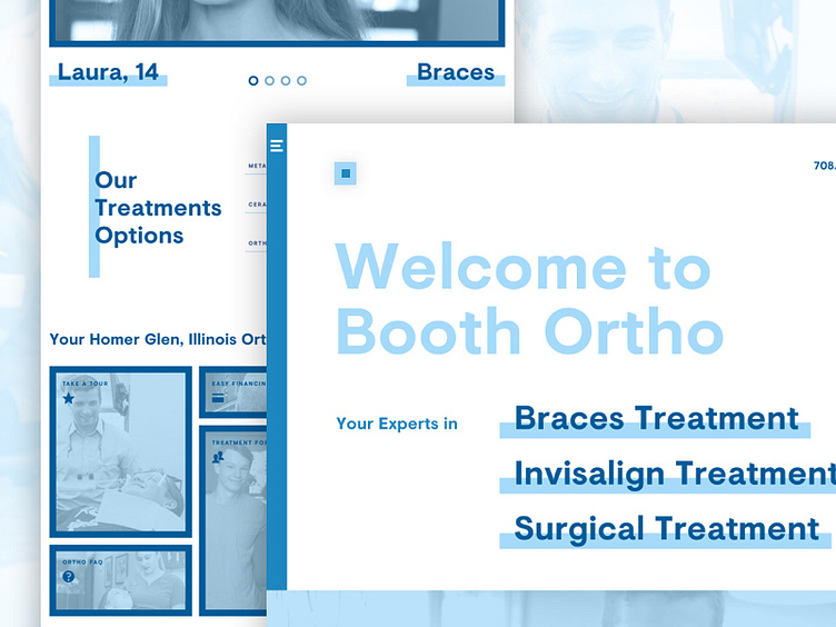
Excited to share an orthodontist website design for a current web project. This design includes stark contrasts, clear hierarchy and typography, a preview of main treatments and website content, evident sectioning, and fresh blue overlays for a modern and clean design.
For updates and case studies, visit Neon Canvas.
More by Kira View profile
Like
