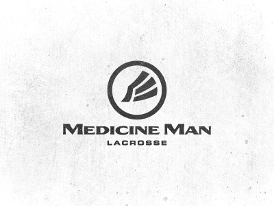
Medicine Man Lacrosse - Logo Design
After a bunch of different concepts and iterations, the client decided to stick with the original logo that I sent in an early stage of development - shown here. He liked the simplicity of the original and that it plays on the 'Medicine Man' as a unique separate identity. Though this brand is sports related, we didn't want the typical sporty feel at all. It's more than just a sport. It's a culture that needs to be represented, creating a platform for like-minded people to meet. A symbol for them to recognize as an integral part of sharing their passion.
After I created the mark, I chose an LHF font and somewhat heavily modified it to compliment the mark, conveying a sense of Native American heritage. To us, its bold. It emphasizes more of the Medicine Man over Lacrosse which is what we wanted. To give the name extra boldness, I further emphasized the capital M's which was exactly the look & feel we're after.
Hope you like it, happy Friday!
P.s. is it just me, or is Dribbble dramatically quiet lately?
