RockStar Revamp 1
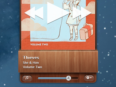
I've decided it's time to update my iTunes menubar app RockStar. Here is my first pass at a redesign, what do you guys think?
The play controls will fade in and out over the album art on hover. I think the stars need to be styled differently but I'm not sure how yet. I also thought some sort of decoration behind the album text would help but I'm not sure what to put in that space yet. I'm thinking red banner but I don't have a clear picture of it in my head yet.
The wood texture used is by @Matthew Skiles http://drbl.in/lPz
More by David Keegan View profile
Like

