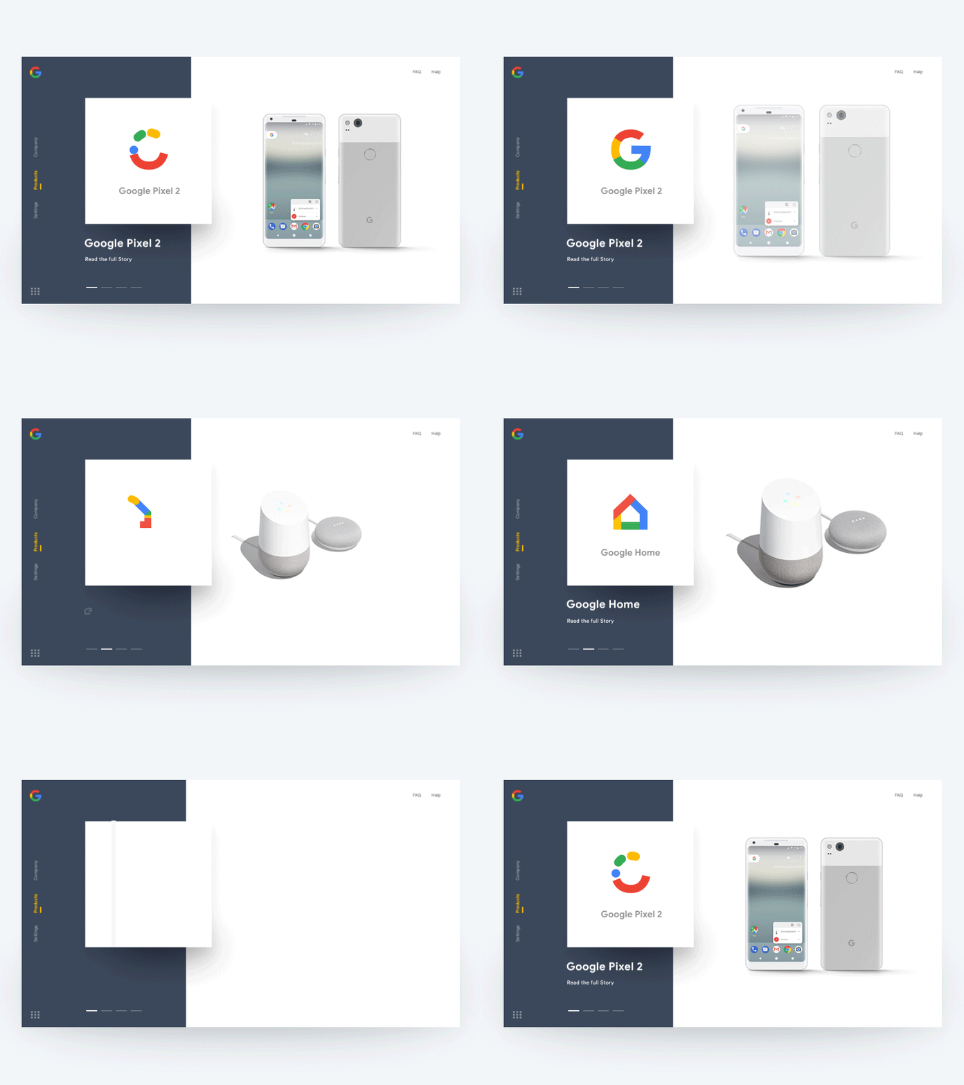
Google Products - Interactive UX
Hey, Dribbblers 👋
After some layout explorations, I'm trying to push myself further with Google product animations.
Glad to share with you my new transitions experiment for the Google product page. The key focus with this one was to combine the interactions on two parts of the page into one and make sure they support each other.
It's important to include product attributes consistently across list items presented in the same product list. When information is included or presented inconsistently across list items, users have a difficult time comparing them and may pass over numerous perfectly relevant products.
Comments and feedback are very much appreciated :)
Follow me on:
www.uxdtechnologies.com
https://medium.com/@dhipumathew
https://www.linkedin.com/in/dhipumathew/
https://www.facebook.com/uxdtechnologies/
https://www.linkedin.com/company/uxdtechnologies/
https://www.instagram.com/uxdtechnologies/
https://twitter.com/uxdtechnologies
https://medium.com/@uxdtechnologies
