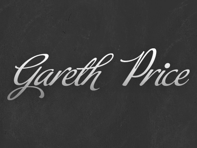
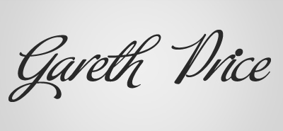
Personal Logotype Updated
Made a few editions:
- Cleaned up base line heights
- Resized/repositioned the r in Price to look better
- Made the stem of P thicker and moved the shoulder up to make it more "P" like (thanks Janet)
I am really happy with this now, but any more feedback would be great!
More by Gareth Price View profile
Like

