Dribbble UI - Concept
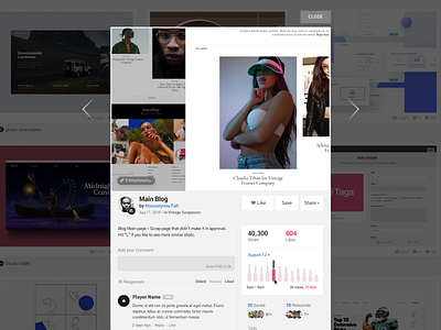
Had a bit of free time today, so had the chance to mock up something quick. Here's my take on the Dribbble's latest UI update.
Main changes on my design:
- Keep all CTA and informations below the shot for better accessibility.
- Place "Add comment" text field above comments for easier access (clicking on text field should expand it and show "submit" button).
- Implement a graph section to expand on "Views" "Like" content.
Let me know what you guys think!
More by Housseynou Fall View profile
Like

