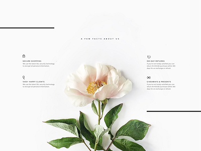
Ecommerce features
This is my second try to post this shot. If you're reading this it means everything goes well 😂
Having new user flow for the posting process this week it's been frustrating to post shots a bit. But the biggest failure I faced today when decided to delete an attachment while all the input fields were filled in with text 😬 After that click on an icon page had been refreshed and everything I finished righting a few seconds ago just disappeared. Hope @Dribbble team improve that flaw 😉
No back to the shot origin. This is me messing around with stripes and minimal layouts. Usually, circles are my fav shape but recently stripes caught my eye because of the finesse they add and accents with so little visual weight.
How do you like it? Do you use stripes and lines as visual enhancements often in your designs? Really would like to hear about your experience 😉
P.S. Attachment contains an alternative version of this ecommerce section.

