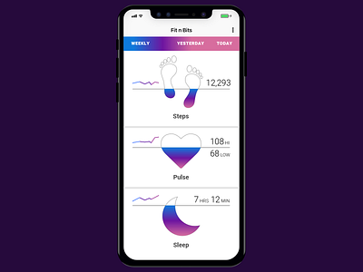
Analytics Chart FitApp
Day 18 of the 100 day UI challenge! Analytics Chart. In my previous workplace I did a lot of data visualization, charts and reports. I wanted to make this somewhat playful while getting realtime analytic data about your body. Its a tough fight to stay simple and keep in mind the users needs. What happens at the end of a design cycle and we iterate to improve the experience? We start adding features. Features can be great as long as its not driven by sales vs an actual need. Im a UI designer, digital designer but its always nice to work closely with a good UX team.
More by Michael Cullinan View profile
Like
