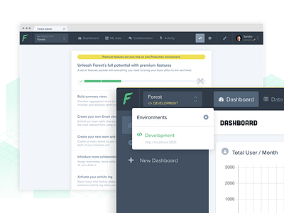
Forest Admin - Interface optimizations
Hello Dribbblers,
Summertime at the office is always a quieter period that allows me to work on the next big projects.
It's also a great period for me to optimize what I've been designing since the beginning of the year.
What about you?
Among all the optimizations I made during this summer, I improved Forest interface so users can better visualize on which environment there are logged in (e.g. development, staging, production...). An indicator bar is now displayed above the navigation bar to indicate the current environment. A set of colors will now help them to differentiate all their existing environments so they'll never be lost again.
I also modified the main menu display by moving the navigation bar to the top of the screen. It gives users more space to navigate through their project and data while simplifying the navigation experience.
Please, share your thoughts in the comments and don't forget to press "L" if you love it! 😉
