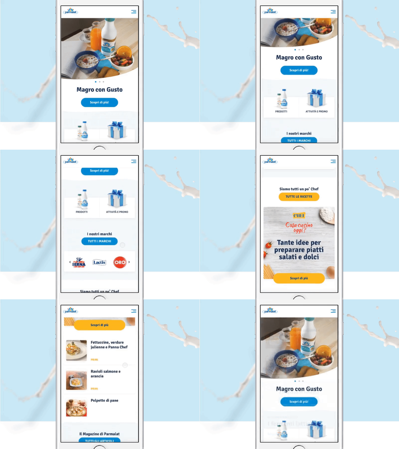
Parmalat Mobile Homepage
A single matrix for three different sites: a complete digital restyling, with one big brand at the base.
Parmalat, Santàl and Chef are all brands of the same family, but you wouldn’t know that from their sites. Through a 360 digital restyling, we took three very different and disconnected sites into becoming individual parts of a fluid brand identity, elevating the design and the user experience.
Thanks to the carousel on the homepage, the user can immediately have a well-defined picture of the vast range of the brands' products and activities under way.
The combination of a simple interface and a common navigation pattern across the three sites helps the user navigate in a natural and familiar way.
--------
Shot edited by @Maje Navarro Baleriola
