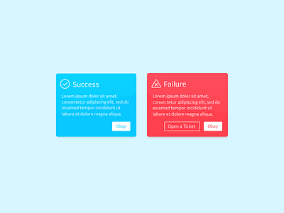
DailyUI - 011 - Flash Message Error Success
Adding some color, but not using it as a crutch. Along with a color that clearly suggests the status of a view (for western audiences who know red as “bad” for such things), having clear titles and iconography make things simple to understand and take action on. When something does go wrong, it’s important to tell someone why, but even better if you give them a path to handle it or reach out for help.
More by Alex Lockwood View profile
Like
