In Progress Dashboard
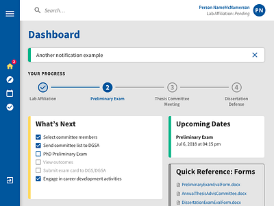
I'm working to redesign an app for PhD students in the med school to track their program progress. The current design, is well, lacking any real design.
My design addresses a few concerns from the client, including: the menu sidebar taking up too much space (mine is collapsable like Google Calendar), dashboard hierarchy (adding color to them and having a primary and secondary style), and a more delightful progress tracker (kept mine simple, but with more flair than what's in the current app).
I've also incorporated a simple hexagonal pattern on the Login screen and expanded menu to add a bit more visual interest.
More by Jen Hubbard View profile
Like
