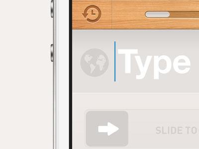
Slide to search
I'm alive and finally found some time to work on this app a little more. Honestly we can possibly ship it as it is right now, but I want to polish couple more things.
So I've actually never liked the previous search button treatment. It felt way too heavy comparing to other UI elements in the app. So I started thinking about fun ways to enhance that little part. I know it might not be the best "UX", or it might really not have any value to it. For example if you're checking out from a shopping cart, "slide to action" might help prevent accidental check outs possibly. I like to question things and try to find the right answer, but here I can't really give you a specific UX reasoning behind my choice, it just feels fun. :)
I will rebound another one to show a more traditional search button.
Feel free to follow me on twitter and ask any specific questions you have.
I've also started sketching the landing page as it might have a little odd layout.
I also want to thank James Blake for inspiring me with his f'in incredible music.

