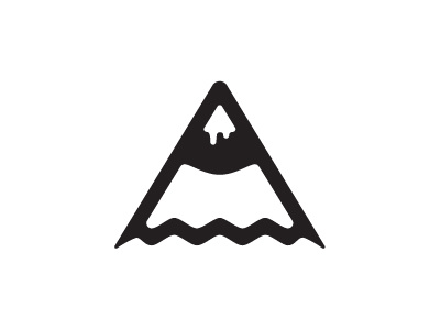
Revised logo?
I've noticed sections of my logo are slightly off (mainly due to poor illustrator skills at time of production) so decided to revise it. There's some golden ratio in there now (in theory) and improved connections alignment.
I'd really like to hear peoples preferences between this and my current version.
If your interested in the meaning behind the mark please see my project on behance which explains the origins http://www.behance.net/gallery/Beaumont-Design-Self-Branding/2830905
Cheers
More by Chris Beaumont View profile
Like
