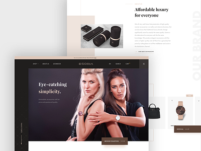
Esoria homepage concept
Hi guys!
This shot is a really special one for me. Two years ago I decided to start a fashion brand with a goal to go head on against overpriced luxury brands. It’s called Esoria and we are focusing just on women’s accessories. When we created our first website we made several mistakes that I want to share with you:
Missing USP on homepage: why anyone should give a f***
I think for starting fashion brand it is extremely important, and difficult at the same time, to distinguish from others. You have to figure our what your brand is about; why people should care or even better why anyone should buy something from you.
If you look at our current homepage you will notice that it does not communicate who we are at all!
This time I made strong hero shot, full of emotions and with solid copy (don’t use “lorem ipsum” in your designs). Do that extra work and either try to write your own texts or ask your client to that. Your designs would make much more sense afterwards.
Social proof
If you are starting a new business you should try to get social proof ASAP and start to implement it to your design. People don’t trust new brands.
For example footers are pretty underestimated here on Dribbble. It’s great place to showcase that you are trustworthy.
In my case I put a badge from Heureka, which is similar service to TrustPilot here in Czech, with number of reviews. I know that badge is ugly but in real world you have to give priority to business goals over esthetics.
Branding ideas
Since we had to design all of the products and did the manufacturing as well I decided to transfer some of the elements to the design. For example we are using what I call “E” pattern on scarfs (see the attachments). So found it interesting to implement it to the design as well.
What do you think? Do you agree with me?
And if you find this post useful, show me some love with your L key. 🙂
Thanks!


