Photography V2
Hey guys
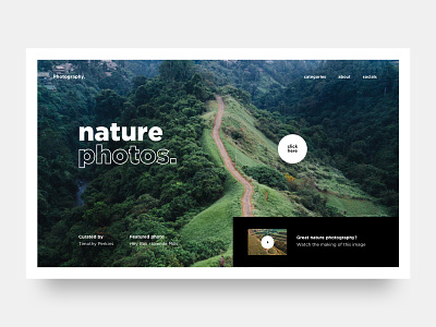
Here's a second exploration for the fun little side project i'm working on. Kind of digging the outline text trend i have been seeing lately so i thought why not give it a go and try some new stuff out.
The 'click here' circle would be your cursor, the text 'click here' would only appear on the custom cursor when the user is on the background image, by clicking the user could start looking at the collection, it was just a quick idea i had, not sure if it's the best ux wise.
Let me know what you guys think!
Have a great day! Peace ✌
————————————————————
Get a free lesson about whitespace and balance!
https://mailchi.mp/2a1d8a58aff7/freelesson
————————————————————
Want to learn design and/or animation?
Check out my classes on Skillshare.
Use the links below and get 2 months Skillshare premium for free!
Design class: http://skl.sh/2h4JrWa
Animation class: https://skl.sh/2D8StYQ
Hope you guys enjoy the classes!

