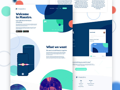
Maestro Homepage
Hello Dribble! This is the finished homepage for my Maestro Bank Concept
This follows on from my previous posts of the Maestro Login and Landing Page utilising the same colour scheme and branding to evoke a fun and playful feel from the bank, aimed at enticing users and making them feel more comfortable and familiar with the bank itself.
Stay tuned for some more pages I will be doing based around this concept!
The initial wireframes and some of my more behind-the-scenes thinking can be found on my Instagram
More by Luke O'Sullivan View profile
Like


