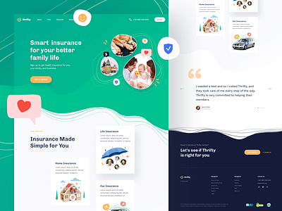
Thrifty Insurance App
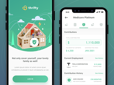
Now we have onboarding screen, the screen for the first impression when user open the app for the first time. The second one is premium subscription detail for contributions, so here we can see our past detail, how long we subscribe this package, how much we spent, etc.
All icons used here is Senja icon set from Iconspace.
Get the trial version of Senja Icon set HERE
----------
We are design and development team. Have a challenging project ? Share us the detail to hello@sebostudio.com
Also check our product at:
More by Sebo View profile
Like


