Library Redesign
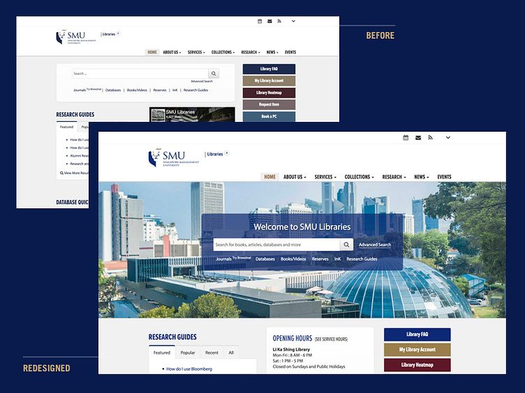
Quick(ish) work on the SMU Libraries site. The team approached us because they wanted add a banner to their site.
I suggested that instead of simply adding a banner (which would push the search box lower) we can use the banner to showcase pictures of the library AND the search bar. Instead of using sketch or photoshop to create a mockup, I created the new block in our development environment and showed the team a live link to preview. There are a couple of suggested changes, but the team is generally happy with it.
One of the things that I learned this year is the importance of delivering value quickly, instead of following the "perfect" process. Tools like PS and Sketch are simply tools for communication (for stakeholders and developers). There will be instances where it's faster to communicate without having to use these tools.
Edit: It's live!
