BukaNonton Light And Dark Homepage
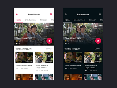

Light and Dark version for BukaNonton Homepage.
When choosing dark or light on your product, always thinking about the readability aspect. Poor readability is one of the main reasons for bad usability. Dark interfaces can be a good option for highly visual projects that don’t require a lot of reading. But, return to its product goals and especially how users access the product.
Let me know your opinion about choosing light or dark interface!