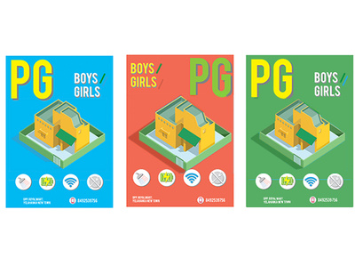
Colour options for a Paying Guest Poster
This was part of an exercise where I redesigned Paying Guest posters in my locality.
Reduced text as much as possible and made it more attractive.
More by Vishal Srinivas View profile
Like
