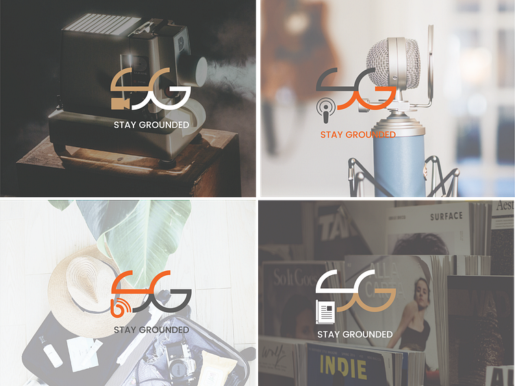
SG Final
This was a logo design I did for a multi-media content company. The logo comprises the first 2 letters of the company, S & G respectively. The client wanted a logo that would be associated with the different content platforms such as videos, podcasts, blogs and eventually printed publications. I added different icons denoting these platform, maybe it was too much ... but I would appreciate any feedback possible. The colours available were the gold colour, and orange and a grey / black, I opted for the grey.
More by sorca duffy View profile
Like
